This is a legacy tutorial, meaning it hasn’t been rewritten since being moved from my old blog. Be aware that it therefore may contain instructions that are slightly innacurate to recent versions of NL2, or that there may be better methods for doing the same thing.
Texture Resolution
The most common question asked about texturing is usually “what texture size should I use?” First, consider that you’ll want to use a variety of texture sizes in your project; textures might have different aspect ratios, be used only on very small or very large objects, or on objects which are only used in the far distance. Therefore, I’d recommend picking a “standard” texture size for your project. To get a point of reference, below are a few examples of standard texture sizes in real video games in the past couple of decades:
- Quake (1996) — 128×128
- Source Games, Half-Life 2 through to Counter-Strike: Global Offensive (2004–2013) — 512×512
- Counter-Strike: Global Offensive revamped maps (2016–present) — 1024×1024
- Current generation titles — 2048×2048 (estimated)
I would, therefore, recommend using a standard texture size of 2048×2048 if possible. If however, you are not able to produce all of your texture assets at this size, I would recommend choosing a lower standard texture size, rather than mismatching different texture sizes. The issues of mixing texture sizes will be shown in the following section.
Texels
A texel is the name we give to a pixel in a texture map when we consider it in a 3D environment. So why the need for two names for a pixel? let’s take a look a texture: Here’s a fairly boring texture, if you view it in its full size you’ll see the individual ‘texels’ in the image. Next, we’ll project it onto a screen that just happens to be the same resolution as the image. We now have a 1280×720 ‘texel’ image projected on a 1280×720 pixel screen, and hopefully you start to see why we need the distinction between the two names. We now refer to the pixels on the screen as pixels (picture elements), and the pixels in the texture map as texels (texture elements). Currently, our pixels and our texels are perfectly in line, but now lets project the texture onto the scene from a 3d object: We’re now looking at the texture on a plane object, with an off-center camera. We’re still showing all 1280×720 texels of the texture map, but we’re trying to fit it in a screen space that is clearly less than 1280×720 pixels. Each pixel consists of several texels. This isn’t really a concern, the graphics engine in the game will blend the pixels using bilinear and anisotropic filtering, giving most textures a realistic look. (although, as in this image, it produces weird effects on geometric textures like our checkerboard) This looks acceptable, because the filter is removing detail we didn’t need, but what about the other way around. Let’s walk towards the wall and stick our face up against it: It’s difficult to see what’s happening at a reduced image size, so open it in full size, and you’ll see that our pixels are now blown up and visible. This time, we have 1280×720 screen pixels to populate, but we’re only looking at a fraction of the texture map, the texels are substantially larger than the pixels. The engine is again running bilinear filtering on the image to blend pixels, but as there is no additional detail to be extracting when zooming in on the image, it can only interpolate pixel values, giving a blurred appearance to the image. This is exactly what we get when we look too closely at our textures. If we consider the hypothetical endpoint of realtime graphics, every texture used would have a resolution so great that we’d alway have a texel density greater than our screen density at any conceivable viewpoint, but this is pretty unrealistic.
Texel Consistency
These goals are in all probability going to be impossible as screen resolutions continue to grow. Instead, we’ll focus on a decent looking standard texture size, and then simply ensure our texel density is consistent throughout our scene. I mentioned that a source game like Counter-Strike: Global Offensive has a standard texture size of just 512×512, but thanks to the artistic expertise of the development team they can still produce better results than we likely can at 2048×2048.  One thing about the low texture size that is well done is the consistency. The illusion of the graphics is maintained despite the low texture size, but if we introduced a single, higher quality asset into the scene, it might look noticeably jarring, and overall worse than if you’d just reduced the texture quality of that asset. The same is true of the opposite. If the brick texture was over-stretched across the wall, it’d be instantly noticeable.
Analysing a scene
This is best done once you’ve finished a whole area of your scenery, as we’ll be comparing all of our textures. We’ll start by making a full copy of the current project, I’m going to take a look at my first project which had extensive 3D work, Point Solitude, and see how well it holds up to my newly asserted standards.
Methodology
We want an easy way to visualise the texels in our textures, and whilst we can’t really see or count individual texels, we can make a texture which shows off our texel count more easily. I’m going to use Adobe Photoshop (CC) for this texture, but any decent graphics package should have the equivalent functionality. Create a new 512×512 image (half this to 256×256 if you chose the 1024×1024 standard texture size). We’re then going to split create a checkerboard in the image as shown: 
In brief, turn on snapping and create a selection from the corner, you should see pink lines when you’re dead in the center of the image. Add superfluous bevels/effects as desired. Or copy and paste mine! We now have a checkerboard pattern where each square contains 256×256 texels. To ensure these texels have consistent density however, we need to tile this checkerboard on an image the size of our textures.
To do this, first select the whole canvas (Alt+A) and go to Edit->Define Pattern, click OK on the dialog that appears. Now, open a new image, starting with the size of our standard texture (1024×1024). Use the fill tool, switch from “foreground” to “pattern”, and then choose the pattern we just saved. Fill the image with pattern. We now should have a 1024×1024 texture, with squares still measuring 256×256. Follow the same instructions and match all of your used textures sizes, I had textures measuring 512×512, 1024×1024, 2048×2048, 1024×512 and 1024×128. You should have a small agglomeration of textures like mine below:  Now, go to Nolimits 2 and make some very basic materials for each of your textures. Now, replace all of the materials in your scene with these materials, making sure you match the old and new texture sizes. Once this is a done, you now have a scene showing you the texel density for each surface.
The results
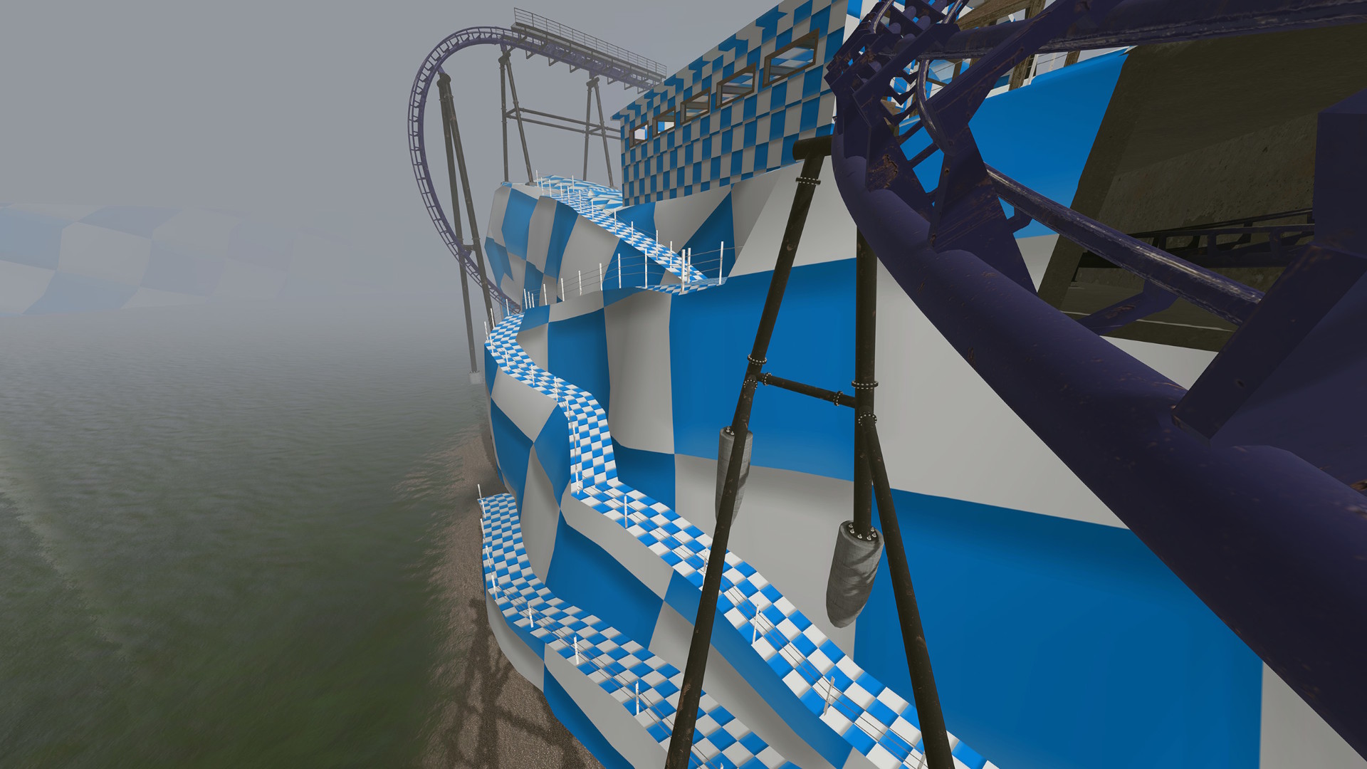
Firstly, we want to pick a texture to use as our reference point. The walls of the station are a standard texture size, and looks good even when close up, so we’ll pick this as our ideal texel density. Nearby textures such as the lower wall texture and roof have similar square size, so they’re fine too. (the roof is a double-size texture, it has twice the texels over roughly twice the size, so the texel density is about equal to the smaller textures)
Fixing the texture
Moving down to the grass, you can see that the squares are quite large, almost twice as large, in fact. Now, for each texture that doesn’t meet our standards, we can do several things:
- Resize the texture
- scale the UV map for this texture, making it tile more/less
- a mixture of the two
This is your decision of course. As the grass texture is a very common one across my scene, I’m happy to afford it the extra graphics requirements and I’ll opt to double the texture size to 2048×2048. I’ll replace the texture in the unchanged copy of the project, and I’ll switch the material in this version to reflect the change.
What if I can’t change the UVs on my model?
If this is the case, you’re probably using Sketchup to make your models. I’ll take the opportunity to politely remind you: Sketchup is not a suitable modelling package for realtime graphics modelling. It’s a powerful tool for designing architectural models, and I’d definitely recommend it for designing buildings in conjunction with a optimisation/texturing pass in another program, but you shouldn’t be using it by itself. Take the time to learn Blender3D, or Autodesk 3DS Max if you have bottomless pockets. The manual meshing and UV controls are critical for your final art pass, and for non-architectural models these programs are just far superior anyway. I shall say no more on the subject for now.
Further examples
This gets quite wordy, read as much as you feel you need to, or skip ahead The grass’ texel density looks great now, let’s move onto the path texture. This ones a little tricky, as the texture includes a grass border, so we can’t scale it horizontally. We could scale the texture vertically a little, but beware, as scaling directionally will look oddly stretched. Other than fixing that glaring UV issue on the right, I’d actually keep the texture at the same resolution, halving the size to 512×512 would leave it too blurry for something so close to the player. In addition, the use of the texture in the background is much closer to the density we want, so perhaps just widening the path model would be a sufficient fix? So you’re aware, the window glass here is about the same density as the station textures from before. Most notably here is the main wall texture. This is a texture not designed to tile much, so has to be spread out quite far. It is currently a 2048×2048 texture, and seeing as it’s the centerpiece of the entire scene, I’d say it’d be worth upping it to a 4096×4096 texture. This seems a little contradictory, I said before not to have one asset vastly better than any other, as it will look out of place. Remember however it’s the texel density, not count, which gives us our apparent quality at any given time. If we double the texture size, we’re bringing the texel density right into line with the other textures here, so really we’re quite safe to do so. We could also double the tiling in the UV map, depending on how nicely this texture looks tiled. Very quickly, the black metal is too dense, so we’ll scale that back, as is the window frame, and the railings. Everything else looks fine, the roof doesn’t look very dense, but I’ll come back to that later. We see the obvious offender here in the cliffs, which are frankly terrible, and I’m embarrassed I ever let this get past me. Let’s take a closer look: What a convenient worst-case example I’ve provided for you. The path resembles an actual “thing”, but the rock is just a collection of pixels. This calls for both a 2048×2048 texture, and a significant UV tile increase too. I’d also consider a 4096×4096 texture for this also, though a new source texture would need to be found in this case.
An Exception
If you hunt around a game in noclip or a level editor, if distant details are rendered in 3D, they’ll get progressively lower detail as you get further away, this saves performance, and quite simply we don’t need that much detail. We can apply the same principle here. Whilst mipmaps will ensure the lowest texture resolution possible is chosen, areas such as the distant cliffs in the previous checkboard image (through the fog), or areas of cliffs which aren’t approachable on foot don’t need that much detail, and may look better with reduced tiling. Again, mipmaps will deal with the performance, so concentrate on the correct aesthetic look, the pathway on the cliff shown helps break up the texture, allowing more tiling, whilst on the other side, with sheer walls, that amount of tiling would become too noticeable.
Actual Photographic Scale
Here are two grass textures. What happens if we set the texel density for the first texture, then switch the texture for the second? The first texture is a distant (almost aerial) grass texture, whereas the second is close-up, almost macro, you can see individual blades of grass in great detail. Remember to consider the distance the photosource was taken at when looking for textures, we really want something between the two. Think of the detail you get out of a good texture, and compare that with your photosource. For example, in a brick wall texture, we expect to see the shape of the brick and some general detail to the brick surface, but we don’t expect to see individual pores in the brick texture. In a grass texture, we expect to see clumps of grass, and outlines of grass blades, but we don’t expect to see three distinct lines forming the shape of the blade, or really many pixel between the edges of the blade at all.
Conclusion
This isn’t something that absolutely must be done, and it’s a little bit of a hassle to implement given all the manual work needed to switch textures, but it’s a useful way to analyse your work, and identify any glaring issues you’ve overlooked. Hopefully you’ll find this useful, and will give you’re scenes a more consistent look. Like last time, here are a few summary points
- Texture size is unimportant, make your textures consistent
- Identify ill-sized textures, and choose the right fix for that situation
- Use additional modelling detail to hide tiling when an increase in tiling is necessary
- ensure the photosource for your texture was taken at the correct distance from the subject