Material Setup
Let’s start by creating a basic material using some pre-made textures, and then see what we can do to improve the result. For a lot of materials, we can get away with just using a Diffuse(or albedo) map and a Normal map. I used this texture from Textures.com, which you can also download after making a free account on the site. You’ll want to download the Albedo and Normal map, and you’ll need to convert the TIFF files that are downloaded into a format NL2 accepts, such as JPEG .
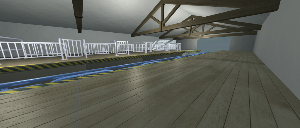
Create a new NL2mat, set the shading mode in the RGB Color tab to Bump Lighting, then go to textures and assign your diffuse map to Texture Unit 0, and your normal map to Texture Unit 1, being sure to enable Bump Mode (using normal map) for your normal map texture. Apply that material to the NL2SCO of your choice, and when you reload the object you’ll get something that looks like this:
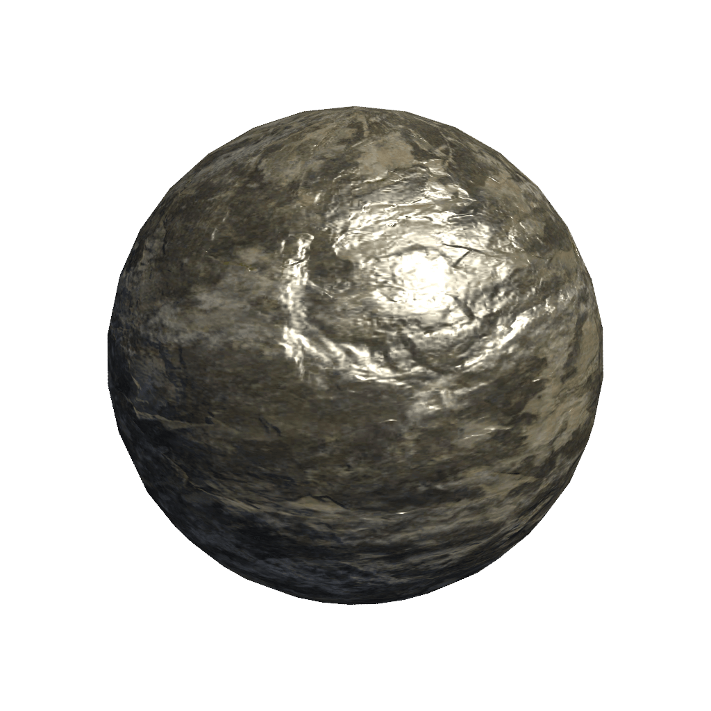
For some textures, the result after doing that might look alright, and you might be tempted to save and use the material as-is. But in the case of our rock texture, something clearly doesn’t look quite right. We’ve got good quality diffuse and normal maps, but we haven’t yet authored the third important part of our material, the specularity.
Theory
Specular shading mimics the two ways light bounces off of objects in the real world. All objects reflect light in two ways; the first is diffuse reflection, where light hits a surface and are scattered in all directions randomly. Some of these light rays eventually bounce into our eyes, and that is how we perceive an object as having a certain colour, or albedo. The second way light interacts with objects is through specular reflection, where light bounces off a surface in a largely uniform direction, at an angle of reflectance from the surface.
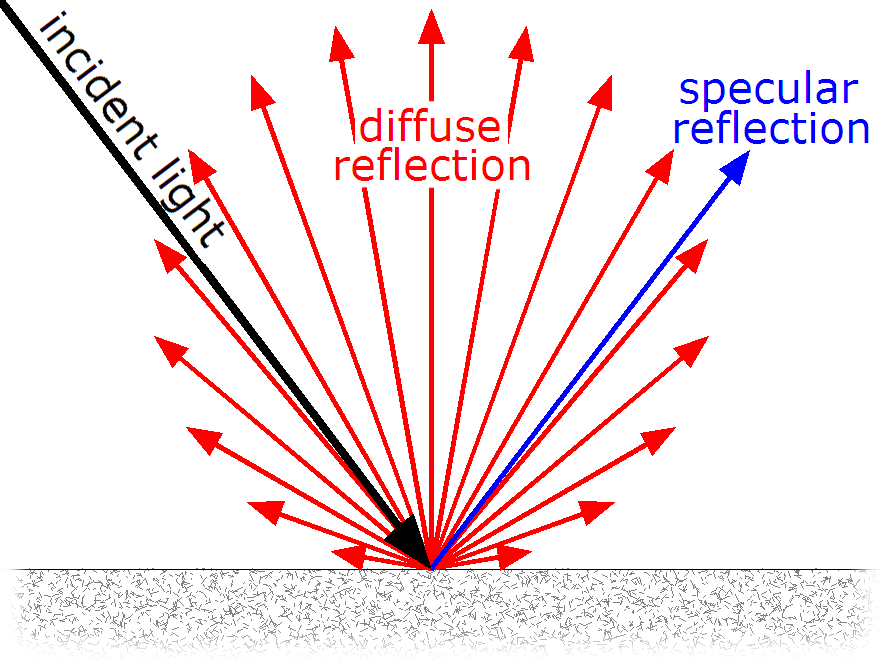
All surfaces reflect light in both diffuse and specular manners, but the ratio will change depending on the surface properties. A matte/diffuse surface will reflect most light diffusely, whereas a shiny surface will reflect more light in a specular fashion.
Phong shading like that used in NL2 includes an approximation of this effect, it is performed on every pixel on the materials surface, and at certain angles will cause the specular dot. Its formula for the specularity, if you are interested, is sinn(θ), where Theta is the angle of light hitting the object, and n is the glossiness value you’ve probably seen in the NL2MAT editor. Take a look at the graph for that formula:
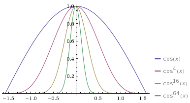
Just imagine the height of the line to be the brightness of the specular dot, and you start to see how the formula can be used to form the shape of the dot on sreen. full white in the centre and the curved edges cause the light to smoothly drop off around it.
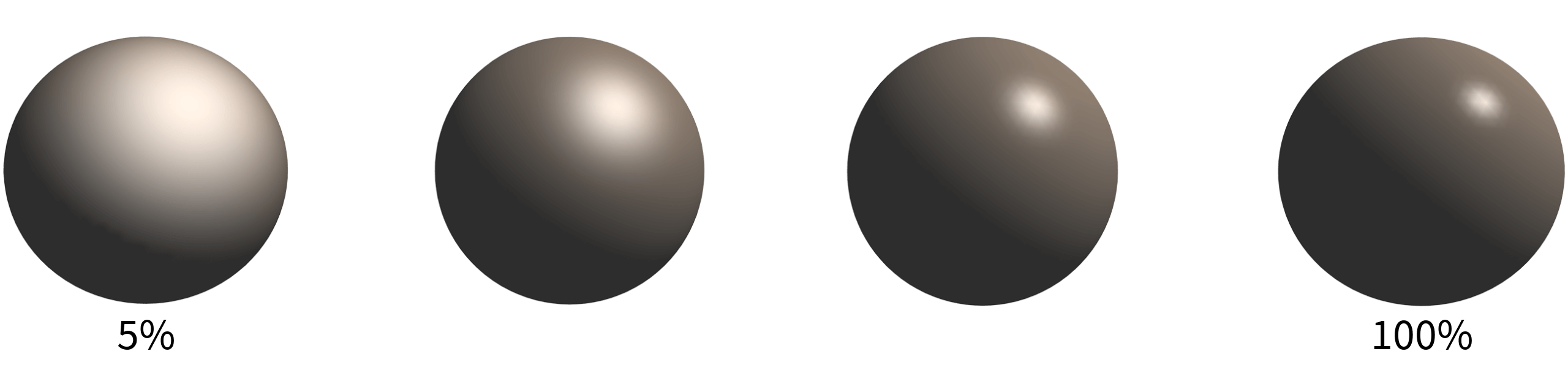
Glossiness values
So, we now know the glossiness slider in the NL2mat editor affects the size of that odd-looking white dot, we’ll take a look at how that changes as we adjust its value. Even without any textures, just changing the glossiness allows us to invoke the idea of different real-life surfaces. In this example, a high value might be reminiscent of a Malteser chocolate, and a low value might be reminiscent of a ball made of velvet.
Let’s now go back to our rock material from before, and apply the theory above to this material. This is intended to be a rough, dry rock texture; it’s surface isn’t polished or shiny in any way, so let’s start by reducing the glossiness to a low value. I enabled Override Glossiness in the Basic tab, and set a low value (5%). I also lowered the specular colour to 50% grey. You’ll often want to change the specular colour in this way, as matte surfaces tend to reflect less light overall.
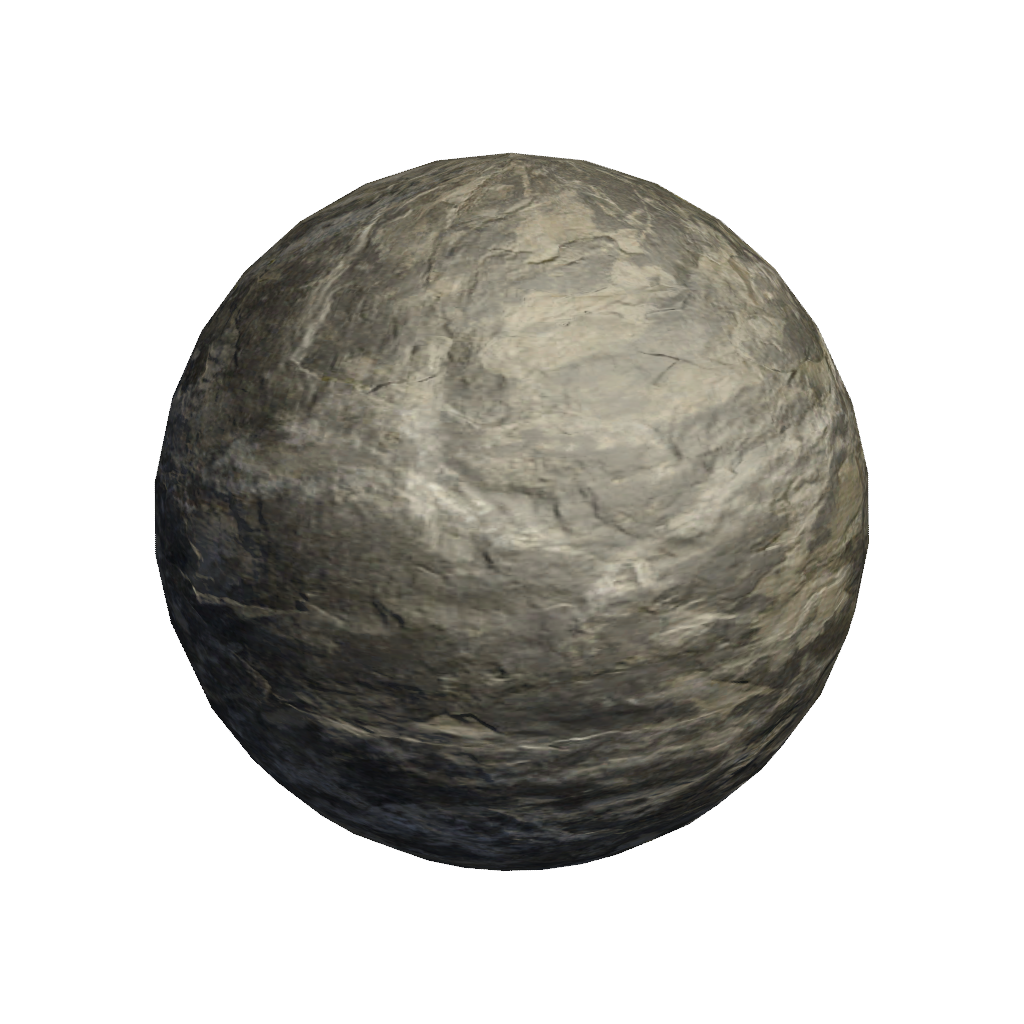
That looks much better. Specular highlighting is still visible, but is much less harsh and without pixels that have been blown out to white.
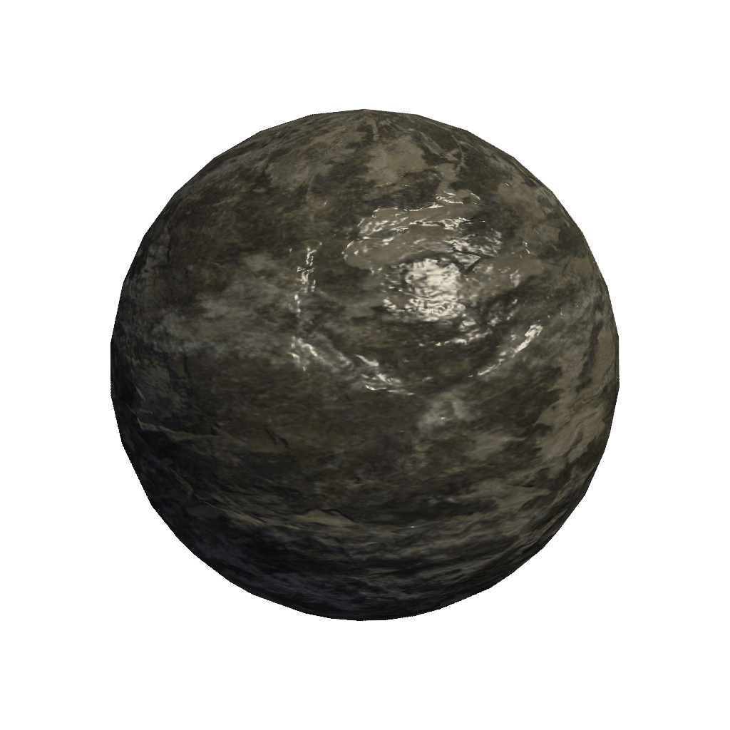
As one final experiment, we’ll change the rock to look like it’s been out in the rain. It’s going to gain glossiness as a result: I chose a value of 90%, which would be suitable for a rock that had been quite thoroughly rained upon. I upped the specular colour slightly to 70% grey, which is more noticable but does not get blown out. As an extra trick to sell the effect, I also darkened the diffuse colour a little by setting the override color to 80% grey. This might not be necessary if your entire scene is wet, but if you have a dry and a wet version of an object near to each other, it will make the transition more believable.
Concluding points
hopefully, that’s given you some things to consider when making your materials, and some new insight on how the shading model actually works. Some concluding hints to refer to when making your materials would be:
- Take a look at real photographic reference for the material you’re creating. Take note of how light reflects from the surface, identify whether you can see specular or diffuse reflections, and to what degree with each.
- Think about the variations the physical material you’re mimicking can take. For example, don’t say “This is rock”, but “This is well eroded and smooth rock, but not polished”.
- Set your shininess value to the right value before touching the specular colour, this will result in a more realistic result.